UX Design, Development

The Local Difference

Taste the Local Difference is a women-owned marketing agency supporting local food producers in Michigan. With an extensive database of local food and farms, a collection of educational online resources, and a lively blog, they needed a visual system that was modular and scalable. Additionally, careful planning was needed to design and build their online directory of thousands of partners.

The Hand-off (Research Begins)

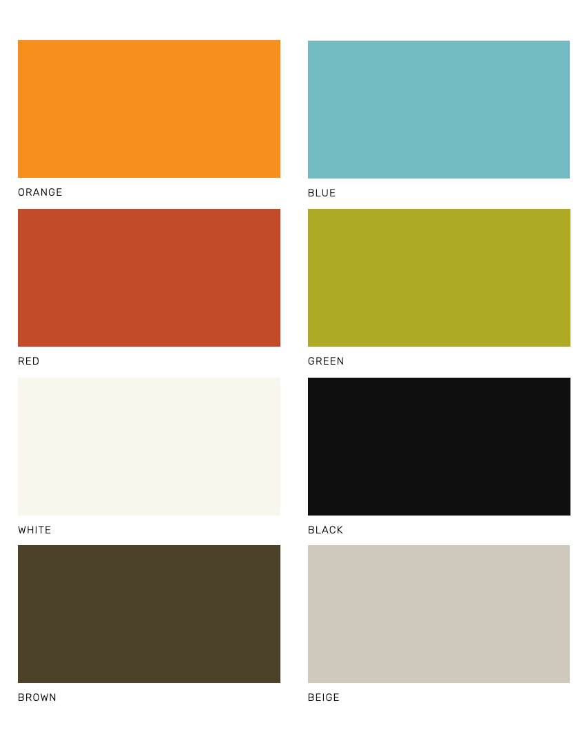
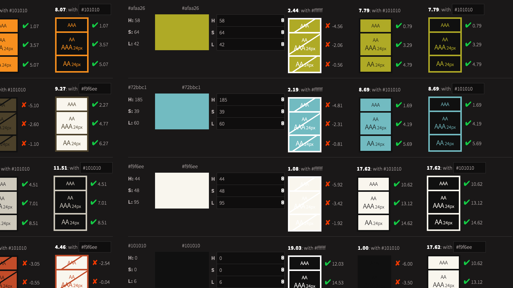
With a brand color palette provided by the marketing team, we were off to a good start with the look and feel for the website and other interfaces. I ran the colors through an automated tool to find every possible combination to get a rough check for legibility and WCAG conformance.

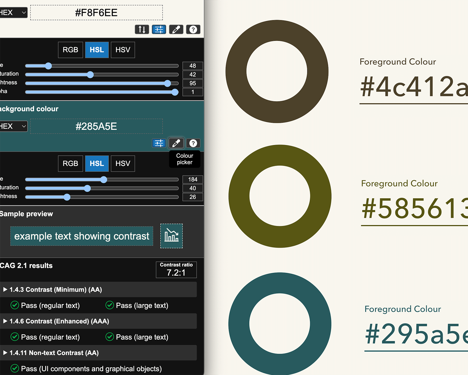
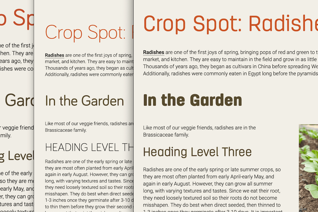
I knew we would need more options for text to use on light backgrounds, so expanded the palette with darker alternatives.

6 rectangles, each a different color.
The original color palette provided by the marketing team.
Many background and text color combinations, marked by whether or not they pass standards.
Accessibility tests with the original color palette.
Three rings, each a different color, darker and more muted than the previous options
Modified versions of some of the colors, available for use on text for sufficient contrast, WCAG AAA.

Exploring Typography

The Local Difference serves a diverse user base in Michigan, including organic farmers, low-income consumers, and small businesses. We needed interfaces that are inviting, compelling, and easy to read.

Three different options using different fonts but the same copy.
Typography samples with different typefaces.

See the Pen TLD Brand – Experimental by Kay Belardinelli (@kanga) on CodePen.

Using Codepen, I created a quick document to test fonts and color combinations.

Designing a Searchable Directory

The directory is a database of thousands of local farms, markets, restaurants, breweries, and more. It needed powerful filtering that was simple and intuitive, and to display results with just the right amount of information.

Wireframe layout with interactive filters at the left and search results on the right.
The directory search page.
Wireframe with the heading 'Piggly Petals Flower Farm'
An individual partner page.
Mobile wireframes for homepage, 'Find Food & Farms', and 'Piggly Petals Flower Farm'
Mobile wireframes for the homepage, directory, and single partner templates.

Bringing the Dream to Life

With help from back-end developer Paul Houser, we completed the full website and directory build where it continues to grow strong!

Some Room for Improvement

  • Accessibility for keyboard-only users could be greatly improved with more obvious focus indicators, and a quicker way to jump to results.
  • Screen-reader users need an indication when results have been updated after selecting a filter.
  • The text inside inputs is hard to read because it's small and light in color.
  • The alt text on images in the search results is mostly either missing or unhelpful.

Try the Database

The filterable layout wireframed earlier but in full color The 'Piggly Petals' page wireframed earlier, but in full color.
All Case Studies
 

“Kay is the sort that bridges technological wherewithal with compassion, empathy and the eyes and voice of not just an artist, but a cherished collaborator as well –

a rare and wonderful thing indeed.”

— Chris Glass
Designer

Let’s build a better web together.

Schedule a one-on-one chat to see if we're a good fit.

Book a Call