Accessibility Audit

Southeast Chicago Storytelling Project

The Southeast Chicago Storytelling Project combines oral history tradition with modern web technology to tell local history through an emotive, personal lens.

Currently in beta and funded by the National Endowment for the Humanities and MIT, the team . My objective was to check the site’s accessibility “health”, and open the door to improvements that ultimately increase access to the public, supporting a vision of inclusivity.

A Cursory Look

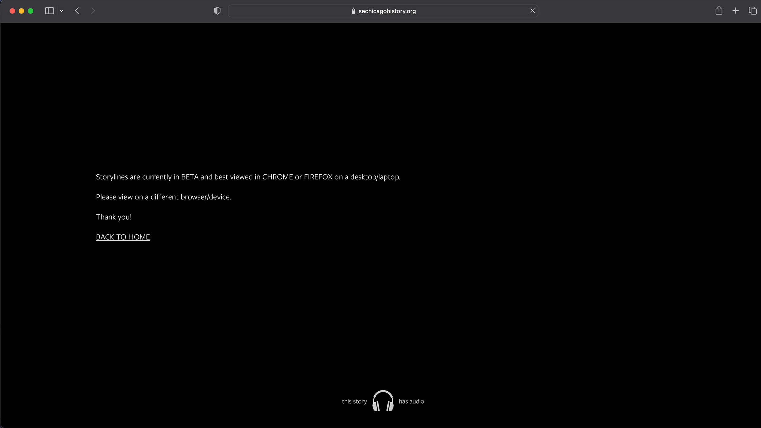
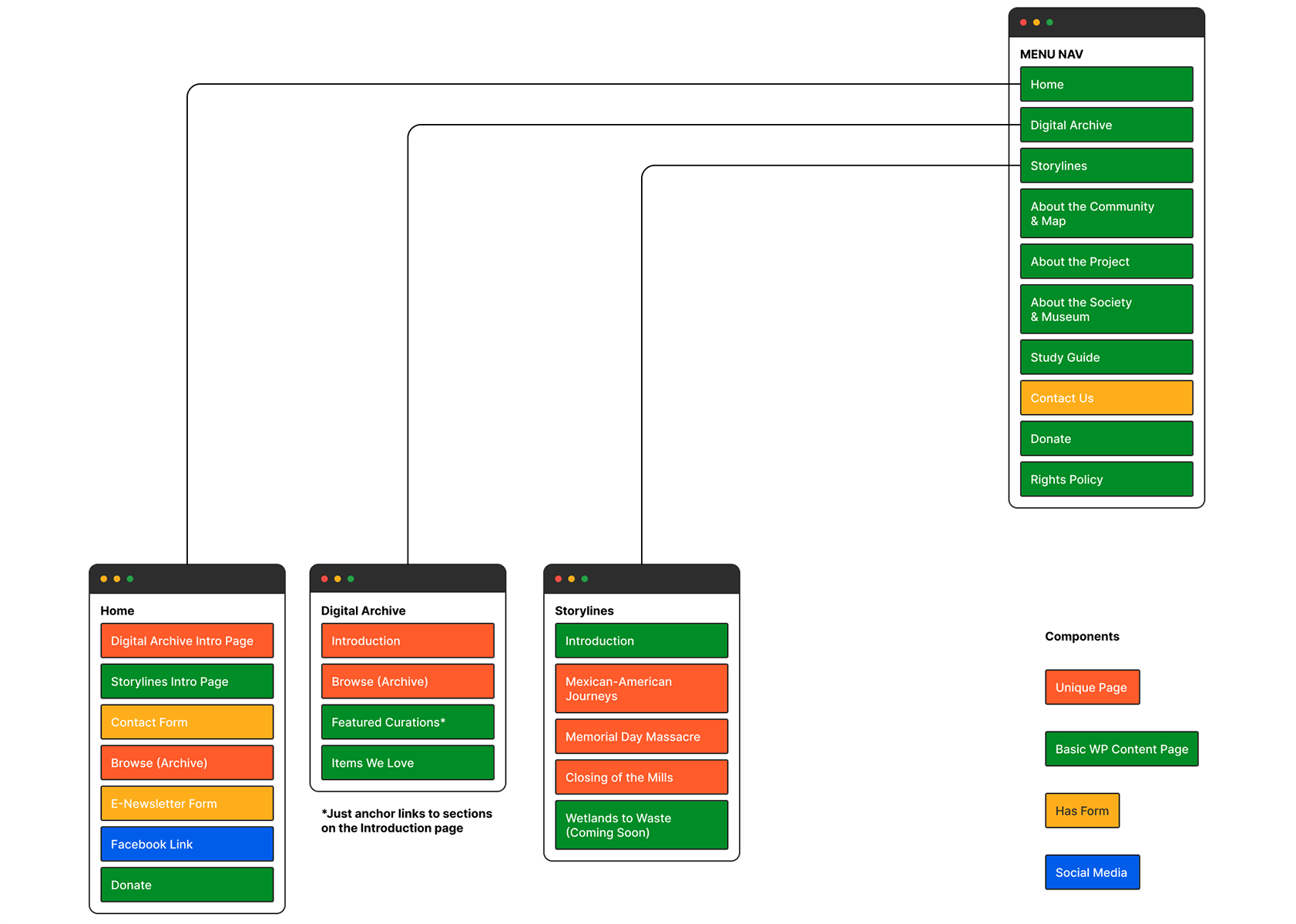
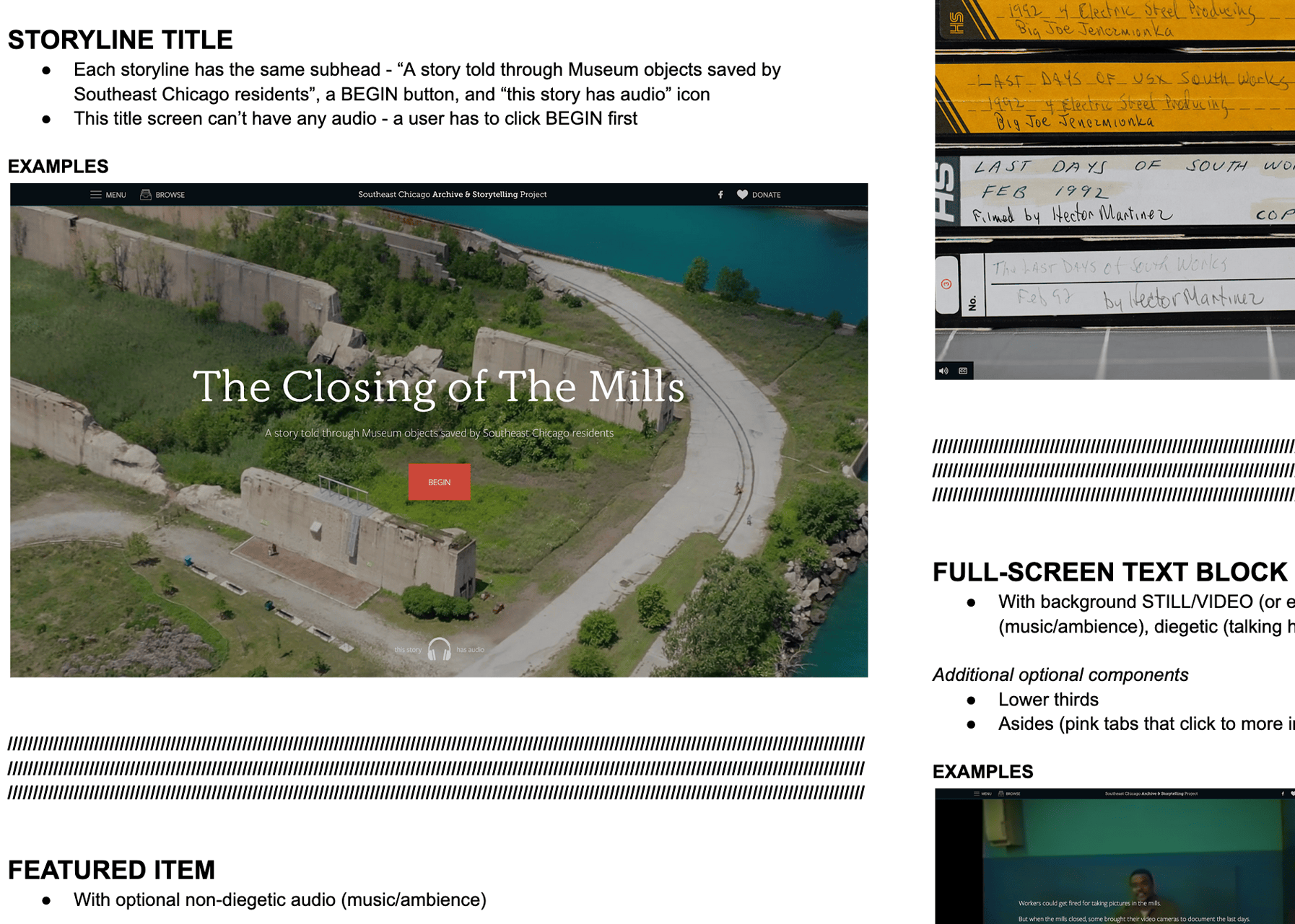
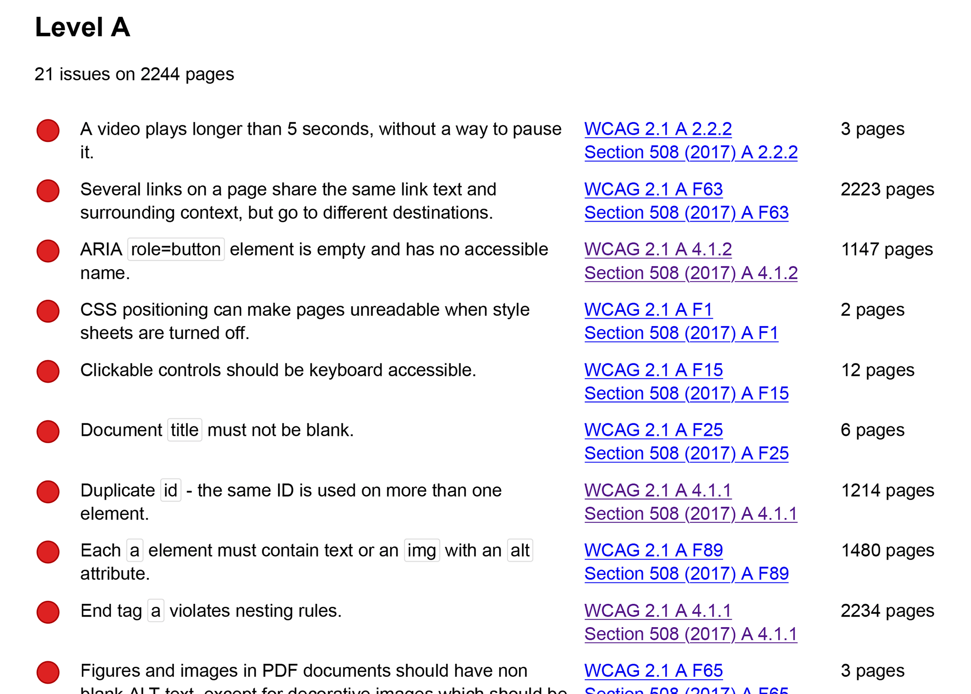
Scrolling through the pages, it was clear they were built using unconventional methods. Interactive elements didn't always behave as expected, triggering new content when clicked. Controls like play, pause, and mute were present, but inaccessible by keyboard. Segments transition beautifully from one to the next, but the user can easily become disoriented without accessible and intuitive controls. Keyboard-only users will be greatly disappointed, as the main navigation for the site cannot be used without a mouse.

A video autoplaying here is a bit strange. I see a play button, but the video is already playing. I see captions of dialogue, but I can't hear it. When I click, a different video suddenly plays.
A map of downtown Chicago annotated with many missing alternative text errors.
A test with WAVE accessibility tool shows alt text missing on many image elements, but it's not clear where these elements are.

Mysterious Elements

Web inspector showing a div element with no discernable content inside.
Inspecting the markup raises more questions than it answers. Here I see a full-page image, but cannot find an associated image element, or even a div with a background image applied with CSS.
An empty page reads 'currently in beta and best viewed in Chrome or Firefox'
Access to these pages’ content is completely denied for Safari users.

Establishing Priorities

Knowing that many pages on the site had critical accessibility issues and were built with non-semantic markup, I worked to identify pages and components that would be the most impactful to audit. Instead of testing everything completely, I would focus on a representative sample.

The entire site would be scanned with automated tools, with the following areas reviewed manually:

  • Standard story component types (16 identified)
  • Unique story components (5 identified)
  • Site header and footer navigation
  • Web forms
A site map with different colors for pages types, with three sections branching off of a box reading 'menu nav'
Site map provided by the development team, indicating pages with unique layouts, and pages that contain forms.
Three screenshots laid out on a page, the headings 'Storyline Title', 'Featured Item', and 'Full-Screen text block'
The development team provided documentation of the standard component types used throughout story pages. These were included in the list of priorities to test.

The Issues: Systemic vs. Specific

The full site was initially scanned using Sortsite, finding thousands of defects throughout the site. Many of these would make it into my final report, but manual testing would be crucial to truly understand how the interface should behave and the major elements that were missing. Using a keyboard and screen reader, I discovered important issues that tools like Sortsite and WAVE were unable to find.

A document listing several accessibility issues, with a header reading 'Level A: 21 issues on 2,244 pages'
An automated scan of the full site using Sortsite echoed some of my initial findings, with thousands of WCAG 2.1 level A violations.
A spreadsheet with 9 rows, with headings that include 'Importance', 'Detail', 'Code', and 'Guidelines'.
A portion of my 9-page report, detailing issues found with both manual and automated testing methods, along with detailed guidance for developers.

View the full report (PDF)

Guidance for Developers

Considering the myriad issues on story pages, including structural ones, remediating each one-by-one would be arduous and impractical. My recommendation is to rebuild the pages structurally with a semantic HTML and progressive enhancement approach, ensuring they are at least accessible to all users on the most basic level.

Unconventional Alternatives

Addressing developer concerns that a rebuild would require resources beyond what they currently have, but motivated to make large improvements, I offered a few alternate ideas:

  1. Two Versions: Design and build an alternate version of each storyline with semantic HTML but without progressive enhancement, and offer the existing versions to users as an “enhanced immersive experience” or something similar.
  2. Web Page as Interactive Video: Treat storylines more as interactive videos than as traditional web pages, and add audio description throughout the entire experience. This approach would avoid a rebuild but may be complicated by the amount of interactive elements on the page. I’d also consider this an experimental approach that would require further research.
All Case Studies
 

“Kay is the sort that bridges technological wherewithal with compassion, empathy and the eyes and voice of not just an artist, but a cherished collaborator as well –

a rare and wonderful thing indeed.”

— Chris Glass
Designer

Let’s build a better web together.

Schedule a one-on-one chat to see if we're a good fit.

Book a Call