Figma, Accessibility, Design Systems

Internal Design System

The design system for this website you are using right now was built in Figma, with a completely modular and accessible ethos.

Many of its elements are designed so that they can easily be reused and rebranded for other projects.

A Scalable Type System

Using a type scale helps ensure that our typographic elements have a sense of harmony when paired together, reduce the decision-making necessary when designing new components, and cut down on the amount of code required for web projects.

For this design system, the Perfect Fourth scale is used.

Text of varying styles and sizes laid out with irregular horizontal alignment.
Freeform play with typography.
A typography style guide with various examples of typographic elements.
The type system with styles for headings, body copy of all sizes, quotes, inline text links, and other common elements.

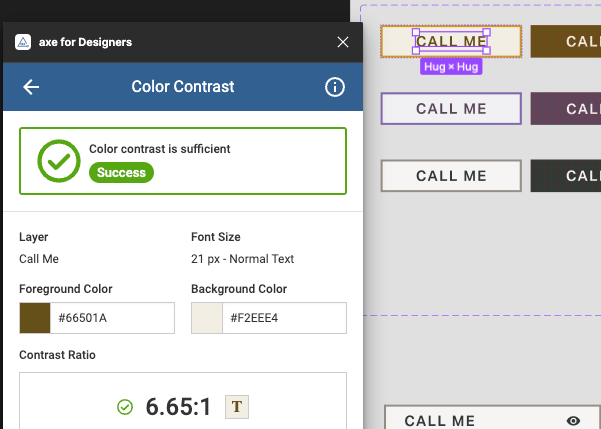
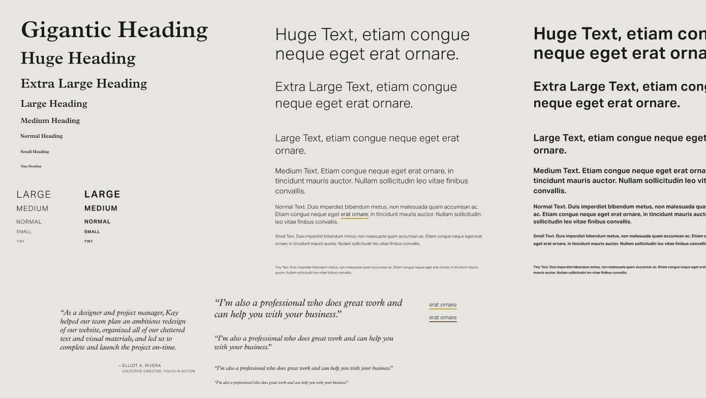
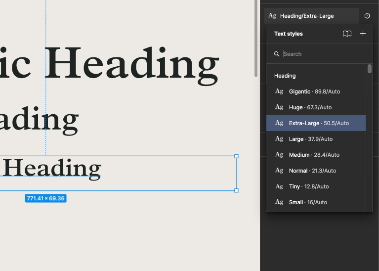
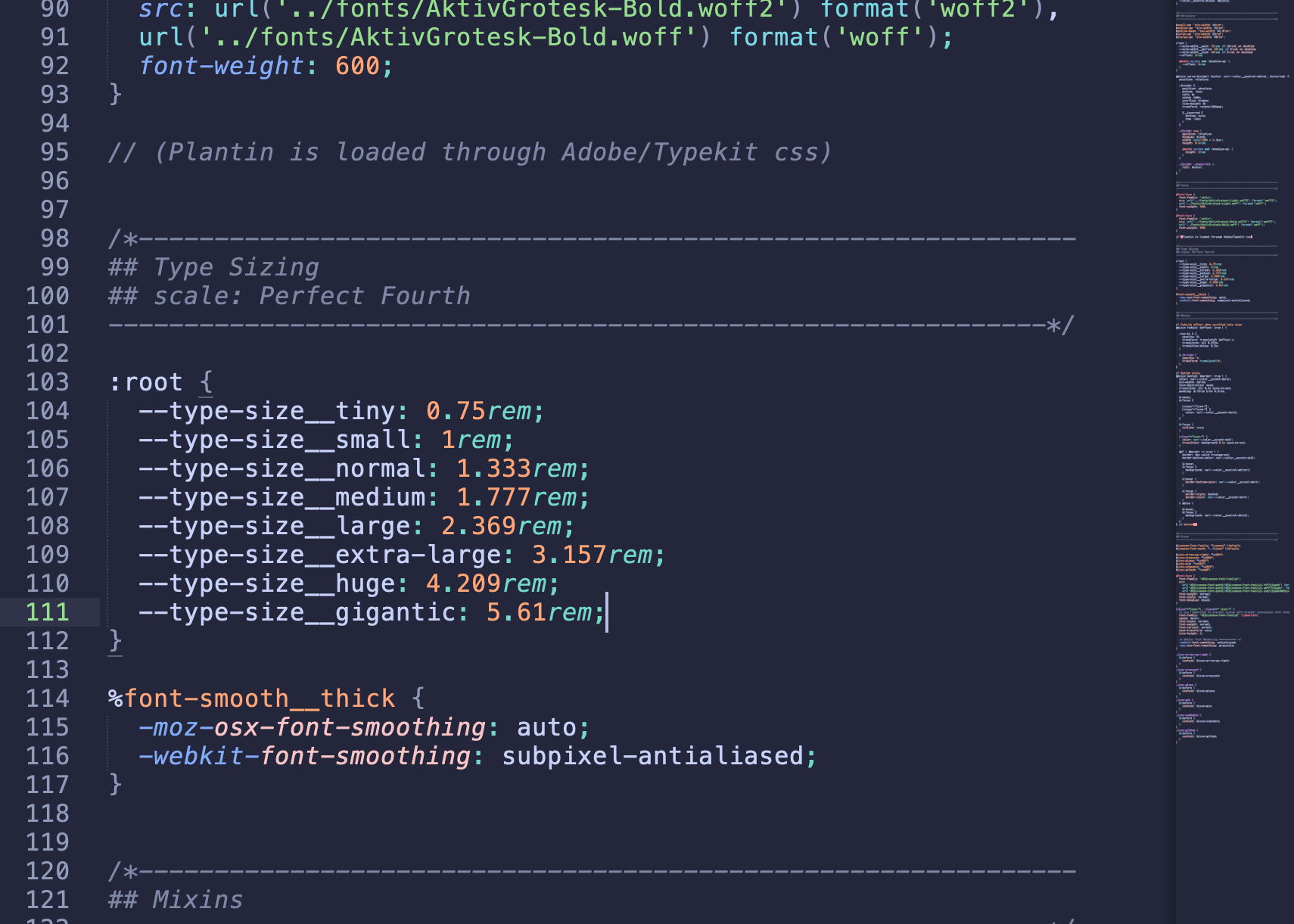
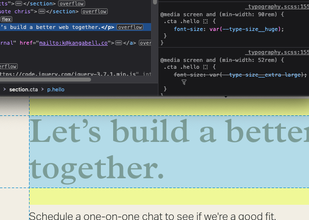
By decoupling font size from heading level (e.g. <h3>), we are able to build HTML elements in the browser that are semantic and accessible, while allowing fluidity of font size for visual effect. All font sizes use a standardized naming system, allowing easy portability between projects.

A dropdown menu of heading styles with an option that reads Extra-Large selected.
In Figma, reusable text styles of each size are available for headings and other typographic elements.
A code snippet depicting Type Sizing with a handful of variables. The code for a heading on a web page being inspected in the web browser.
Font sizes are set with variables in CSS. Here, this large text is using the <p> element semantically with font size variables, adjusted with each viewport breakpoint.

The Color Palette

Naming colors with generic terms allows us to create variables that are easily swappable, building a system that can be reused across client projects.

Color swatches with names like Accent, Text, Light, and Dark.
The basic brand color palette.
Color swatches shown in a Figma UI panel.
Color palette easily available throughout the Figma project.
A code snippet depicting variable names like 'color neutral dark'.
CSS variables created for each color.

Expandable, Accessible Components

A component library is built, ensuring each element meets WCAG 2.1 AA standards for accessibility, and is easily customizable and reusable throughout the Figma project.

An array of buttons and form fields in various styles.
The component library of buttons and form elements, with states for hover, focus, and errors.
Element options displayed in the Properties panel in Figma.
Custom boolean property on buttons for whether or not an icon is present. Toggling this option adjusts the element’s layout while maintaining its size.
A handful of icons displayed in a menu in Figma.
The button's icon is easily swappable for another icon in the design system, without editing the icon element directly.
A color contrast tool selects text on a button and declares 'color contrast is sufficient.'
Testing color contrast on button text against WCAG AA success criteria using "axe for Designers".
An element is selected with an annotation reading '526 x 57'
Touch targets are tested to ensure they meet the minimum requirement of 24px for accessibility.
All Case Studies
 

“Kay is the sort that bridges technological wherewithal with compassion, empathy and the eyes and voice of not just an artist, but a cherished collaborator as well –

a rare and wonderful thing indeed.”

— Chris Glass
Designer

Let’s build a better web together.

Schedule a one-on-one chat to see if we're a good fit.

Book a Call