Prototyping, Branding: Collaboration with J Hogue

Parallel Futures

Parallel Futures is a privacy-first office app suite and alternative to Google Workspace. Using open-source federated software, it allows information-sharing between autonomous, decentralized organizations.

Through research and discovery, I found our guiding archetypal personality:
The Explorer: Optimistic, strong, and lighthearted.

A Constellation of the Human Imagination

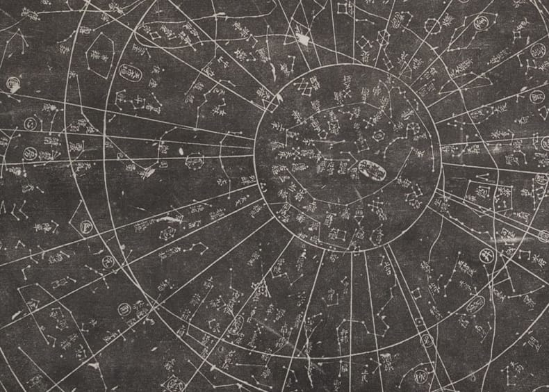
Combining this concept with the archetype of the Explorer, I drew in the metaphor of constellations. Throughout the world, ancient cultures created mythologies around constellations, showing an infinite possibility of human imagination. Drawing from such a primitive human experience (star gazing) gives the brand an innate sense of inclusivity (without being on-the-nose). With astrology rising in popularity, the concept is both timely and absolutely timeless.
The company name repeated many times in different fonts.
Chinese astrology chart.
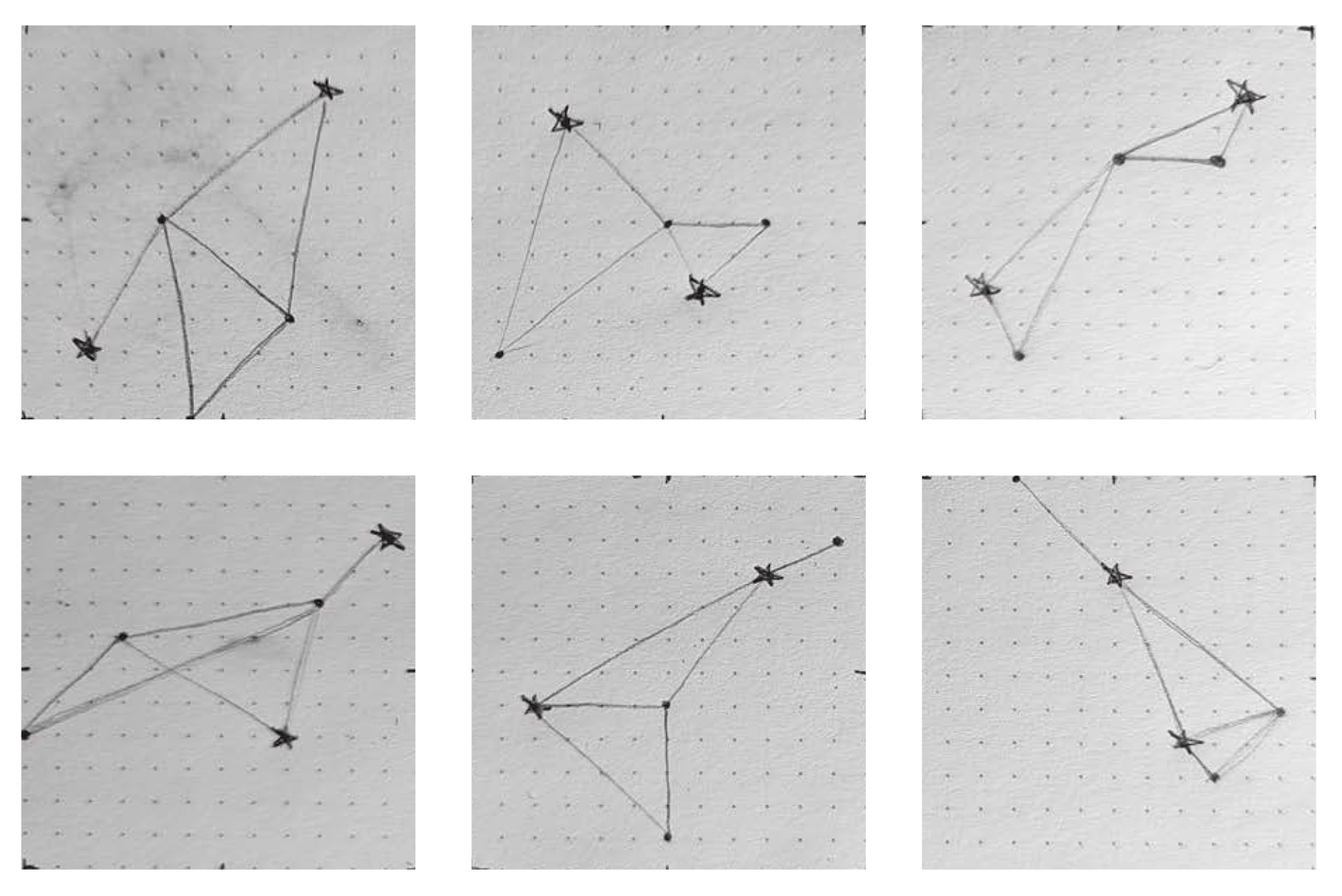
Pencil sketches of invented constellations.
Early sketches from J.

To help with illustrations on the project, I called in the talented designer J Hogue.

With two of us collaborating we were able to reach greater heights!

Color and Optimism

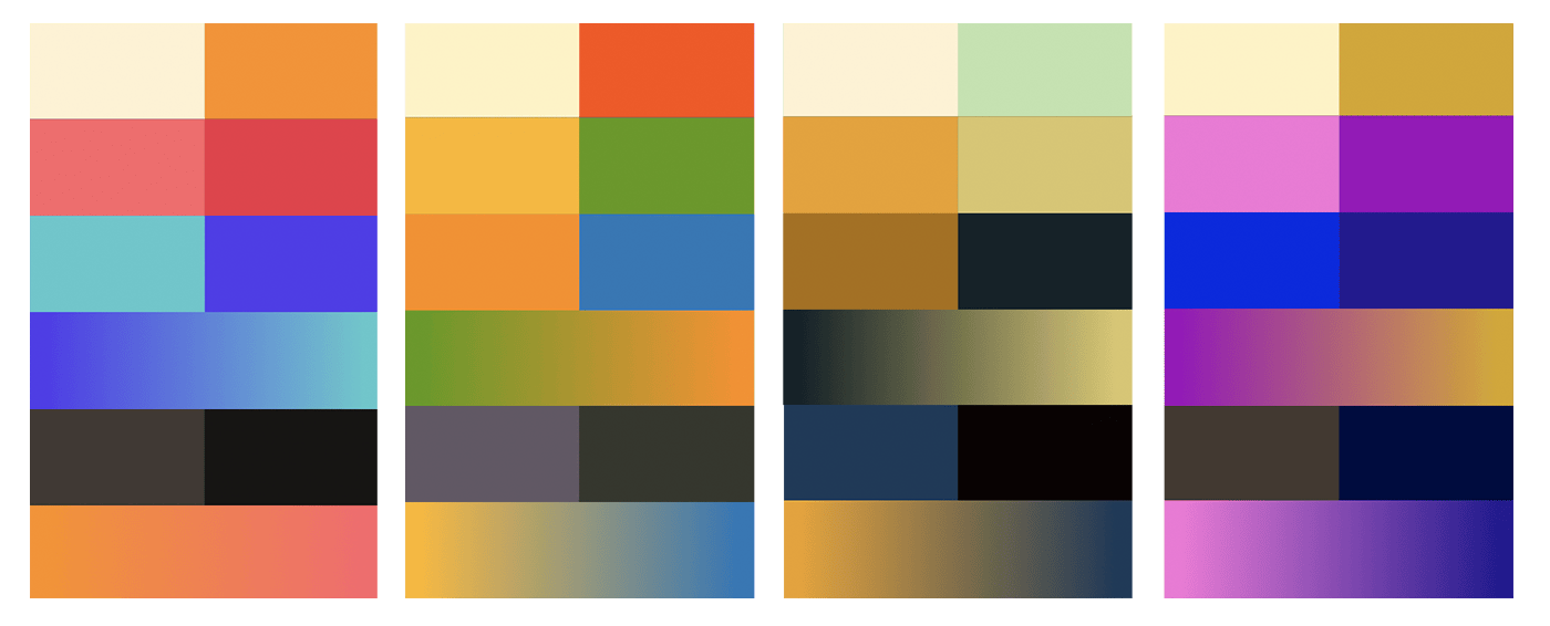
Researching the existing tech landscape, I found a lot of sameness. Grayscale and blue. These palettes were a bit stiff, dated, and may read as masculine-leaning. I wanted to go beyond what was expected for a tech company, and use a palette that felt gender-inclusive and new. Something that is at once technological, futuristic, and optimistic.

Four color palettes filled with bright colors
Color palette options.
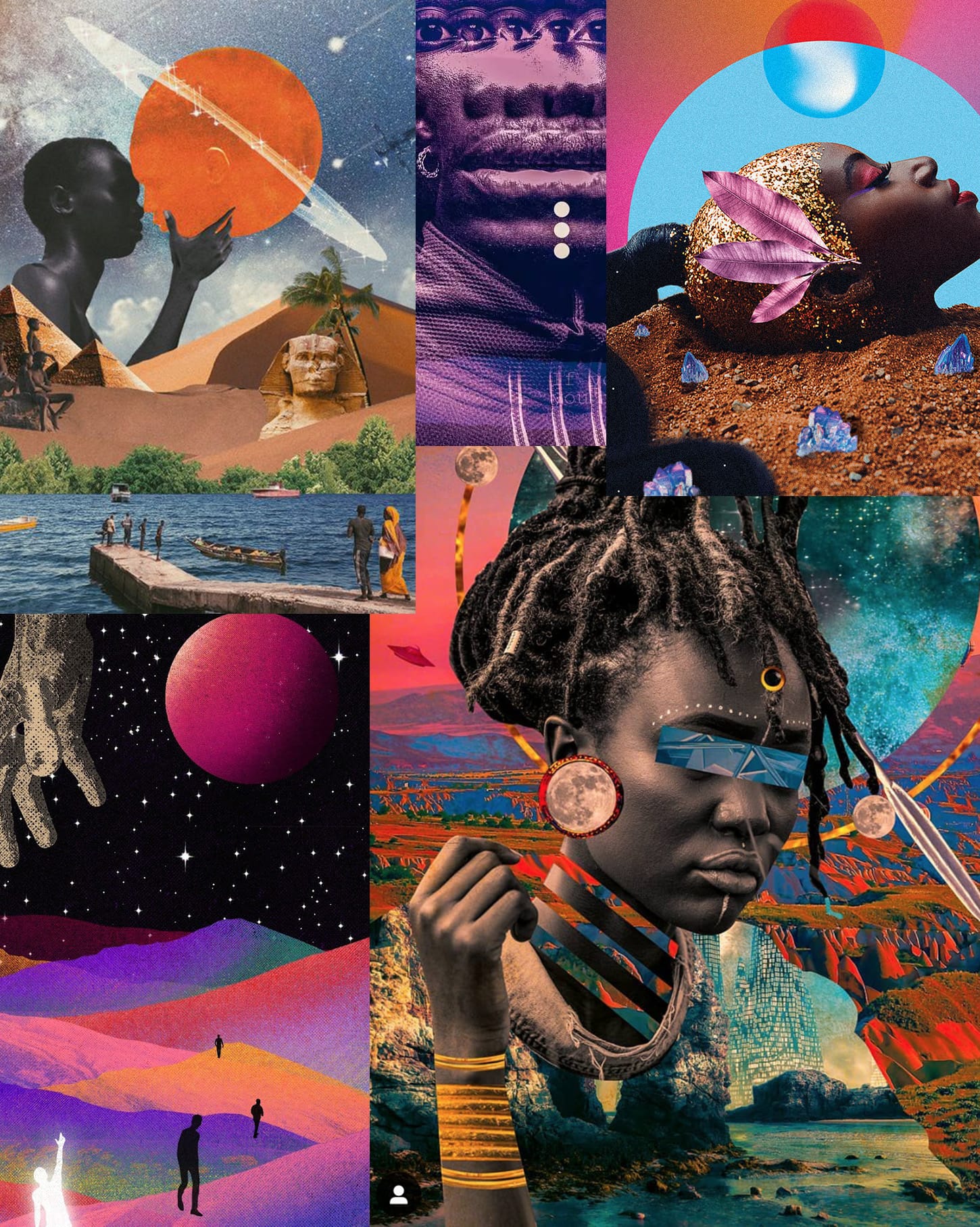
A collage of imagery filled with bright colors and outer space motifs.
A handful of Afrofuturist visual works as inspiration.
Logo that reads 'Parallel Futures', shown on a dark and a light background with a few constellation illustrations.
The logo on both dark and light backgrounds.

The Constellation Generator

J came up with the idea that a system could be programmed to draw constellations using a set number of points and steps. Each system user could get their own version of the logo. This would give each customer a sense of individuality, while still maintaining a strong thread within the product brand.

With HTML canvas and javascript, I built a prototype of a randomized constellation generator. It's a bit rudimentary, but give it a try!

Regenerate

Prototyping in the Browser

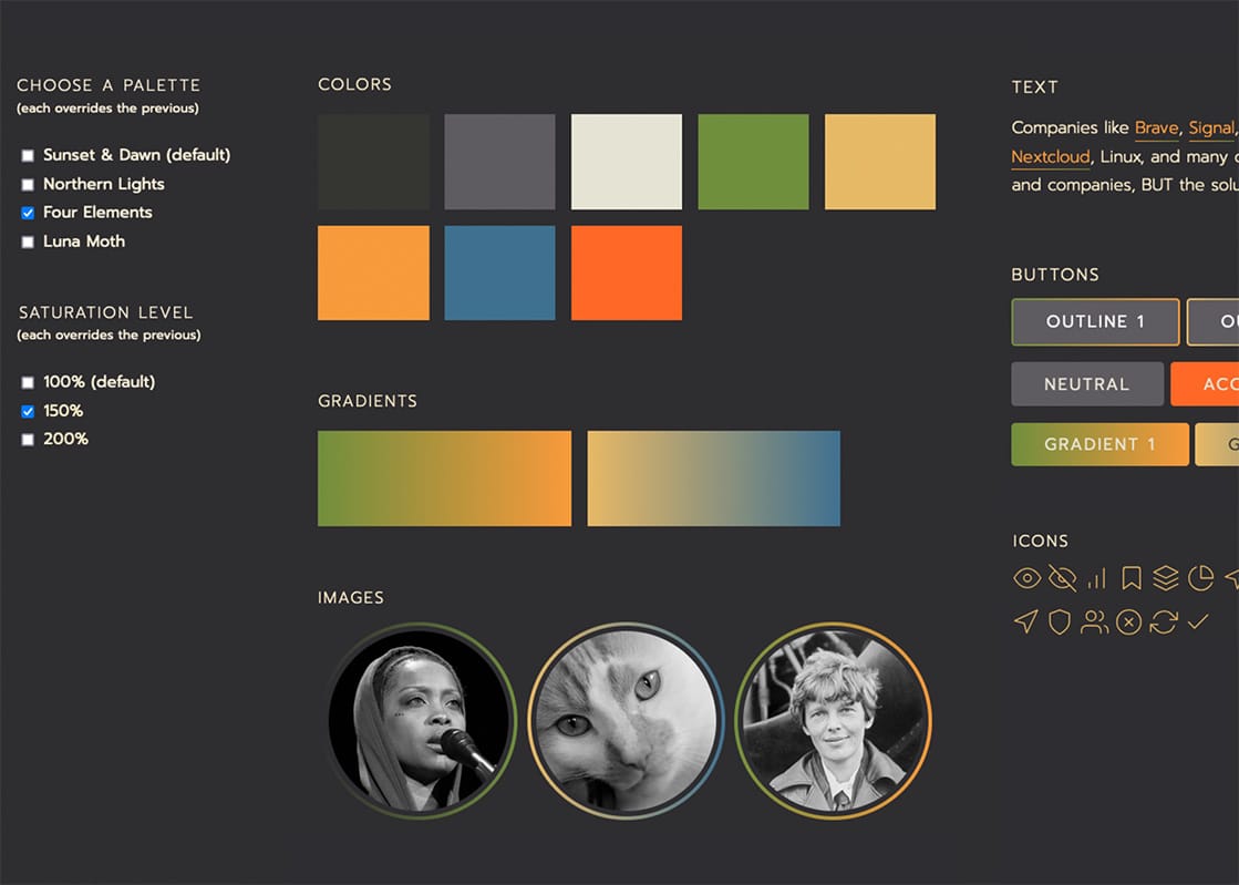
To get a sense for how these colors would read in context, and if they'd have enough contrast to meet accessibility standards, I built an interactive component playground with variable sets to easily swap out the palette and saturation.

Room for Improvement

  • Automatically detect color contrast ratios, and flag ones that don't meet at least WCAG AA criteria.
  • Improve the controls so that they use radio inputs instead of checkboxes, adding javascript for the functionality.
  • Add more robust visual state changes to focusable elements.
  • Include more elements to get a broader sense of how color would be applied in a completed interface.
A small web app with checkbox controls, a color palette, and components like buttons.

View on Codepen

All Case Studies
 

“Kay is the sort that bridges technological wherewithal with compassion, empathy and the eyes and voice of not just an artist, but a cherished collaborator as well –

a rare and wonderful thing indeed.”

— Chris Glass
Designer

Let’s build a better web together.

Schedule a one-on-one chat to see if we're a good fit.

Book a Call